In this tutorial I’m going to run through how to create a sci-fi UI or HUD in After Effects using our Chronos sci-fi UI template kit.
Chronos provides a great base to work from, the key to creating a great futuristic interface with it is layers, the more layers you add, the more intricate the design becomes, the cooler it looks. Well, I think so anyway!
So, let’s get started, here’s the UI we’ll be reproducing (roughly):

To get started, open the Chronos template project - the project will be opened and become an untitled project so be sure to save the project as a new file - call it something like “Core level UI”
Done? Great, let’s create a new composition called Core UI, or something similar; for this tutorial we’ll make it an HD comp (1920x1080 24fps). The chronos elements are all vector based so they can be resized without losing quality.
Let’s get creating an interface!
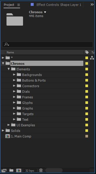
All the Chronos elements are contained in the Chronos folder in the project window:
We’ll start by creating the layered dials in the centre, the core if you like, this is made up of multiple dials.
Open the folder: Chronos > Elements > Dials > 2. Dials
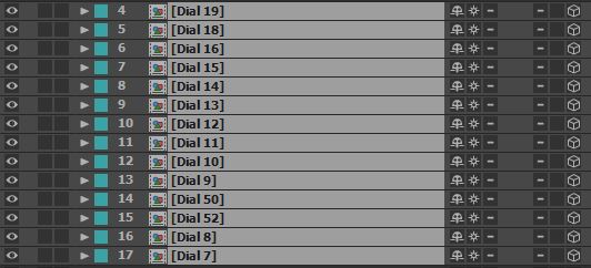
This folder contains all the front facing dial compositions, to create the core we’re going to use a few different dials to give a nice varied look to the interface, feel free to use some different options to vary it up a bit.
We used dials 7 - 16, 18, 19, 50, 52.
Chronos works best in 3D space so be sure to check the 3D layer option once you’ve added the dials to your composition. Another option to check is the “Continuously Rasterize” control (the little star icon next to the face) like so:
This basically turns all the individual dial buttons 3D and makes it look a lot more realistic. It’s also useful when scaling compositions up to retain the quality.
With all the layers selected, hit “T” on the keyboard - this will bring up the opacity for each layer, change the value for each to about 40%, this will come into play a little later on.
At the moment we’re seeing the dials head on, all on top of each other, to create the core we need to distribute the dials in 3D space.
First, add a null object to the composition, make it 3D, and call it “Dial control”. Next select all the dial compositions and parent them to this new null object using the pickwhip tool like so:
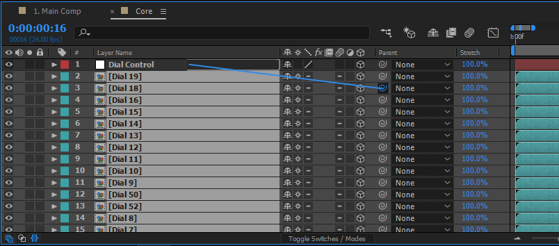
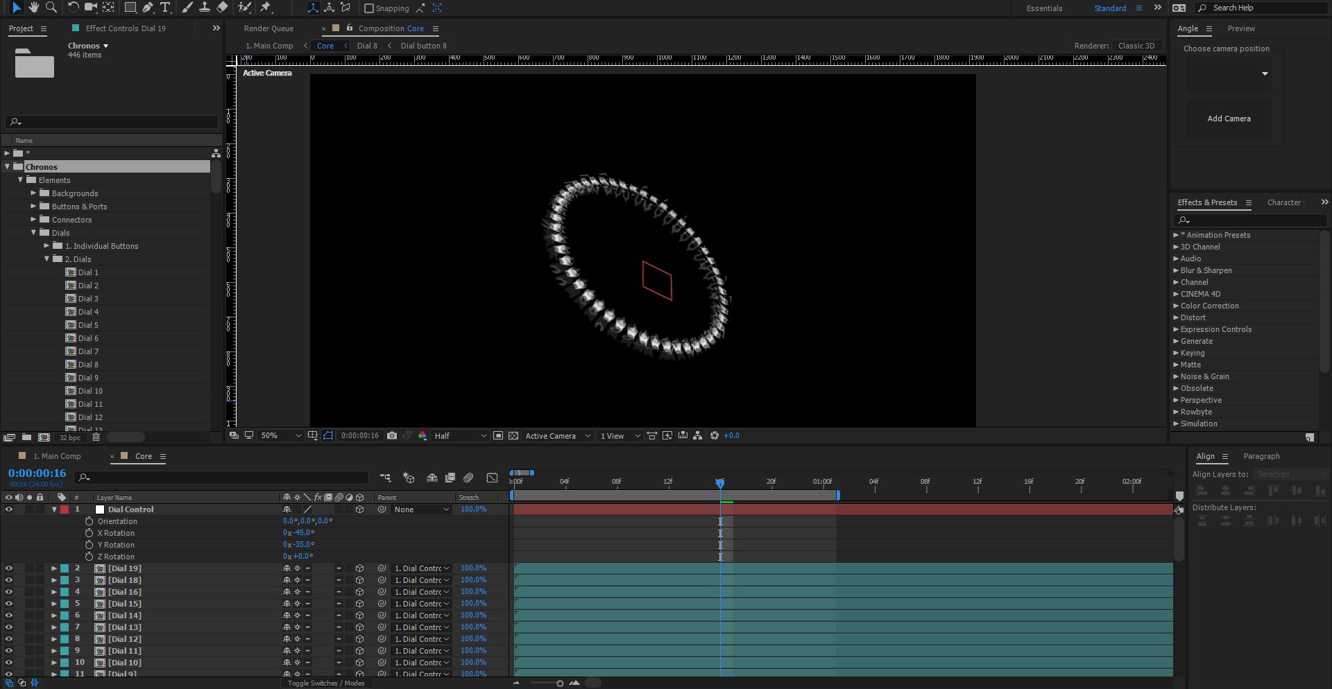
The dials are now parented to the Dial Control null object, which means we can now change the rotation of all the dials at once.
Select the Dial Control null object, hit “R” to bring up the rotation control, enter the following values:
- X Rotation: -45
- Y Rotation: -35
You should now see something similar to this:
Now with this view, we can get to work distributing the dial layers in 3D space! Select all the dial layers and hit “P” then “Shift + S” - this will bring up the position and scale properties.
This is where you can experiment with different values, for the position there’s 3 different values: [0,0,0] focus on the last value, this is the Z-axis. Add in different values for each layer to distribute them. Once you’re happy with the position, experiment with different scale values to vary the dials up a bit like so:
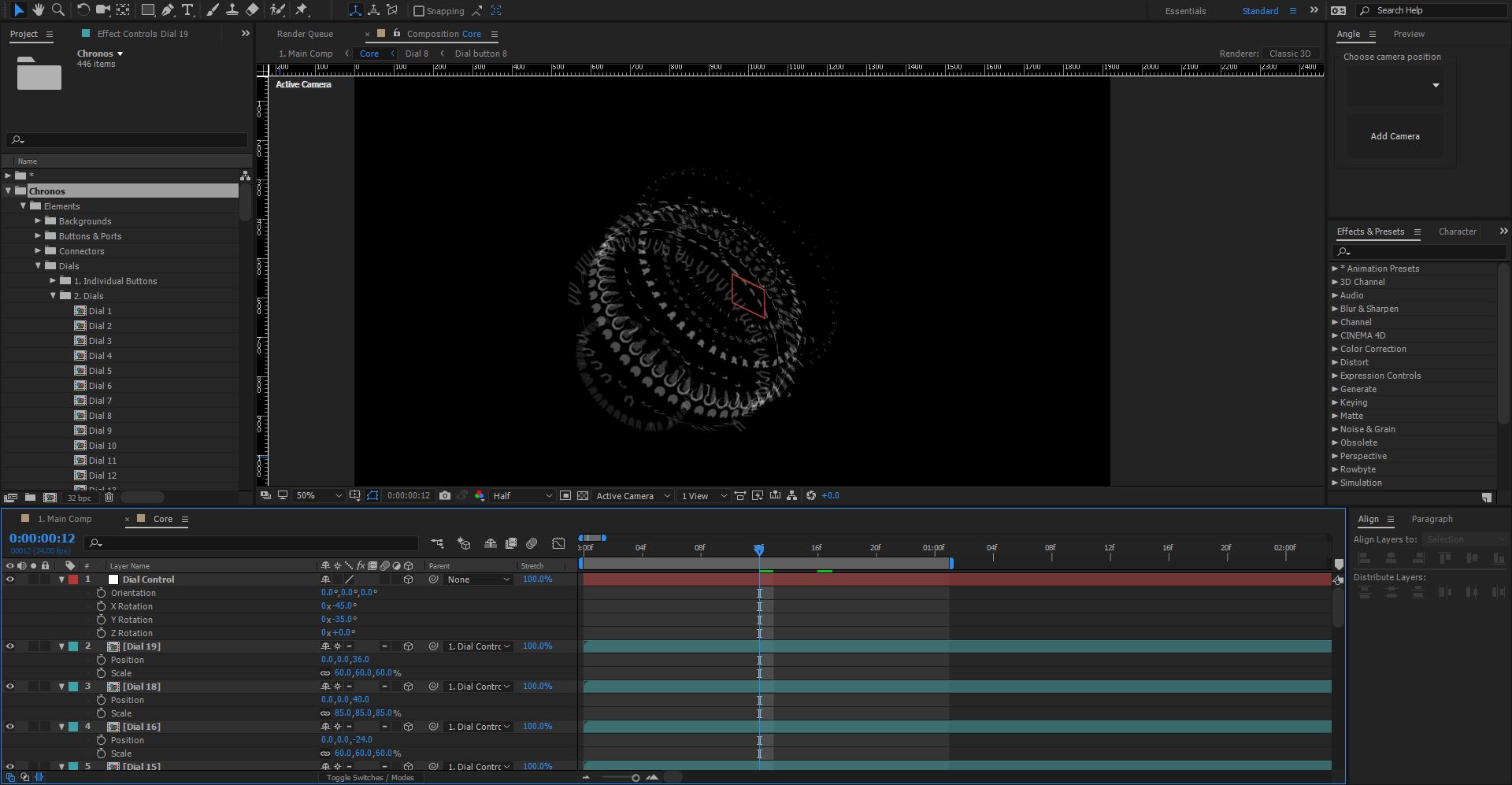
In just a few steps you can already see how the core is taking shape!
As well as the front facing dials, there’s also the “Dial columns” (Chronos > Elements > Dials > 3. Dial Columns). These compositions are slightly different, each dial button is rotated along the Y-Axis, this means when you rotate it like the dials above, it forms more of a column shape in 3D space.
Let’s take a look, repeat the steps above only this time use some Dial Columns instead of the dials like so:
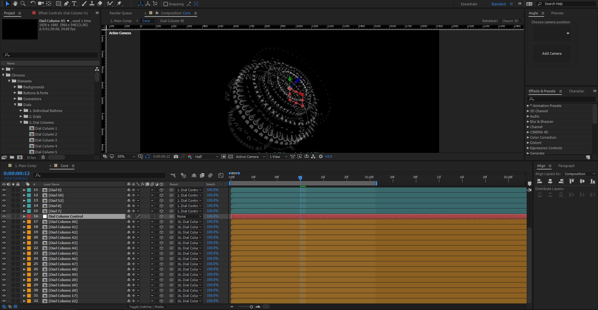
(You’ll notice we called the null object “Dial Column Control” to separate the two different null objects)
There you have it! In just a few steps, we’ve created something that already looks pretty futuristic just by arranging the compositions in 3D space.
The next step is to add the surrounding interface elements, again, the key to the Chronos UI template is layers, creating a really cool futuristic look is pretty much just about layering.
To get started, first select all the layers we’ve made so far and choose: Layer > Precompose or hit Ctrl+Shift+C on the keyboard, call this precomp something like Core and click OK.
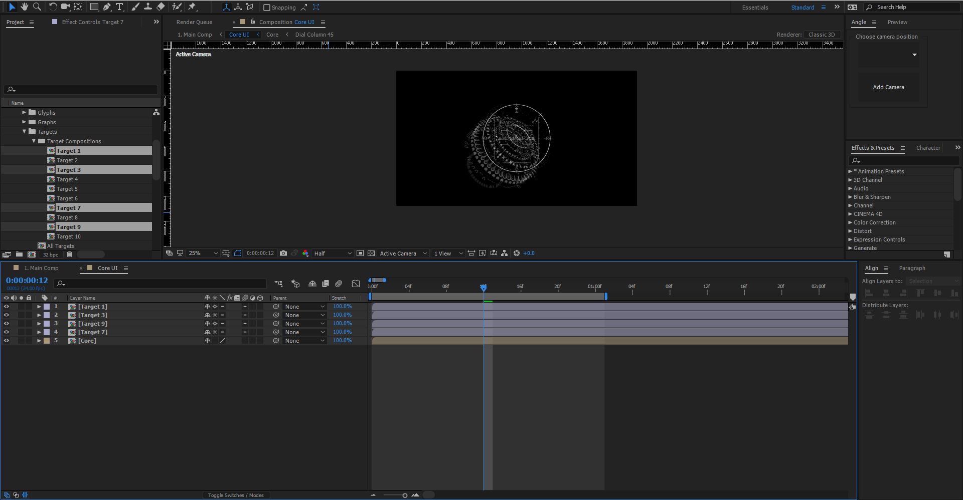
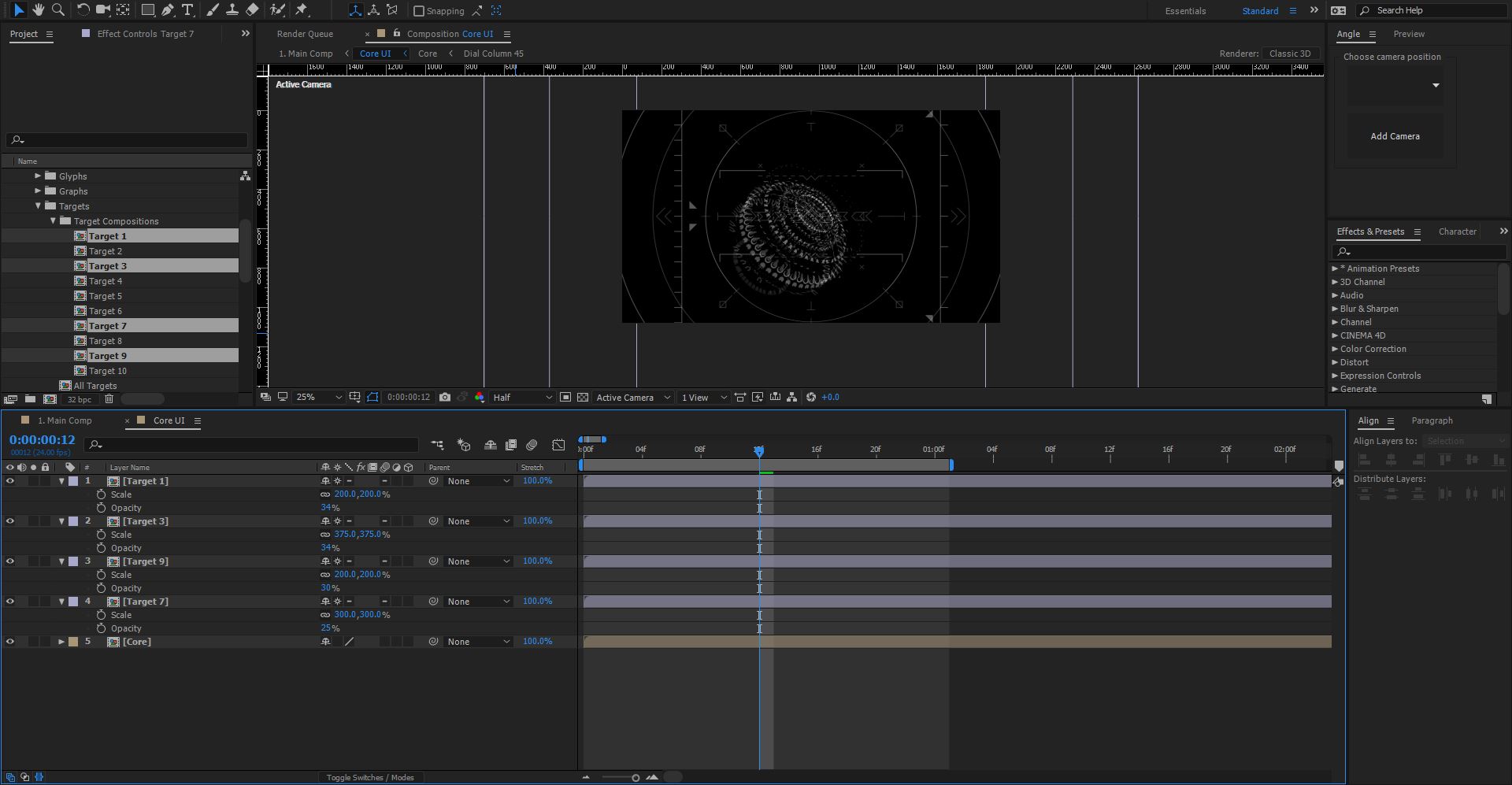
Next, we need to layer up the surrounding elements, in the example we showed at the start we used a combination of targets: Chronos > Elements > Targets > Target Compositions - again experiment with different targets if you like.
In the project panel select Target 1,3,9, and 7, drag and drop them into your composition, like so:
Again, make sure the “continuous rasterization” option is checked.
Next, scale the targets up! At least double the scale of each target to produce some interesting overlays. As well as scaling them up, change the opacity of each target layer to something below 50%, you can experiment with your own values to get a good look, here’s how ours looks:
At the moment all the targets are pretty flat, if we were to add a 3D camera they’d all appear in one flat lump. If you want to, you can make the layers 3D and offset the position along the Z-axis to give them more depth. The next thing we’ll add is some diagnostic text: Chronos > Elements > Text - we’re going to add the “Diagnostics Text Writing Longer Section” composition above all the other elements. Then re-position it so that it lines up with the vertical line of the target we added like so:
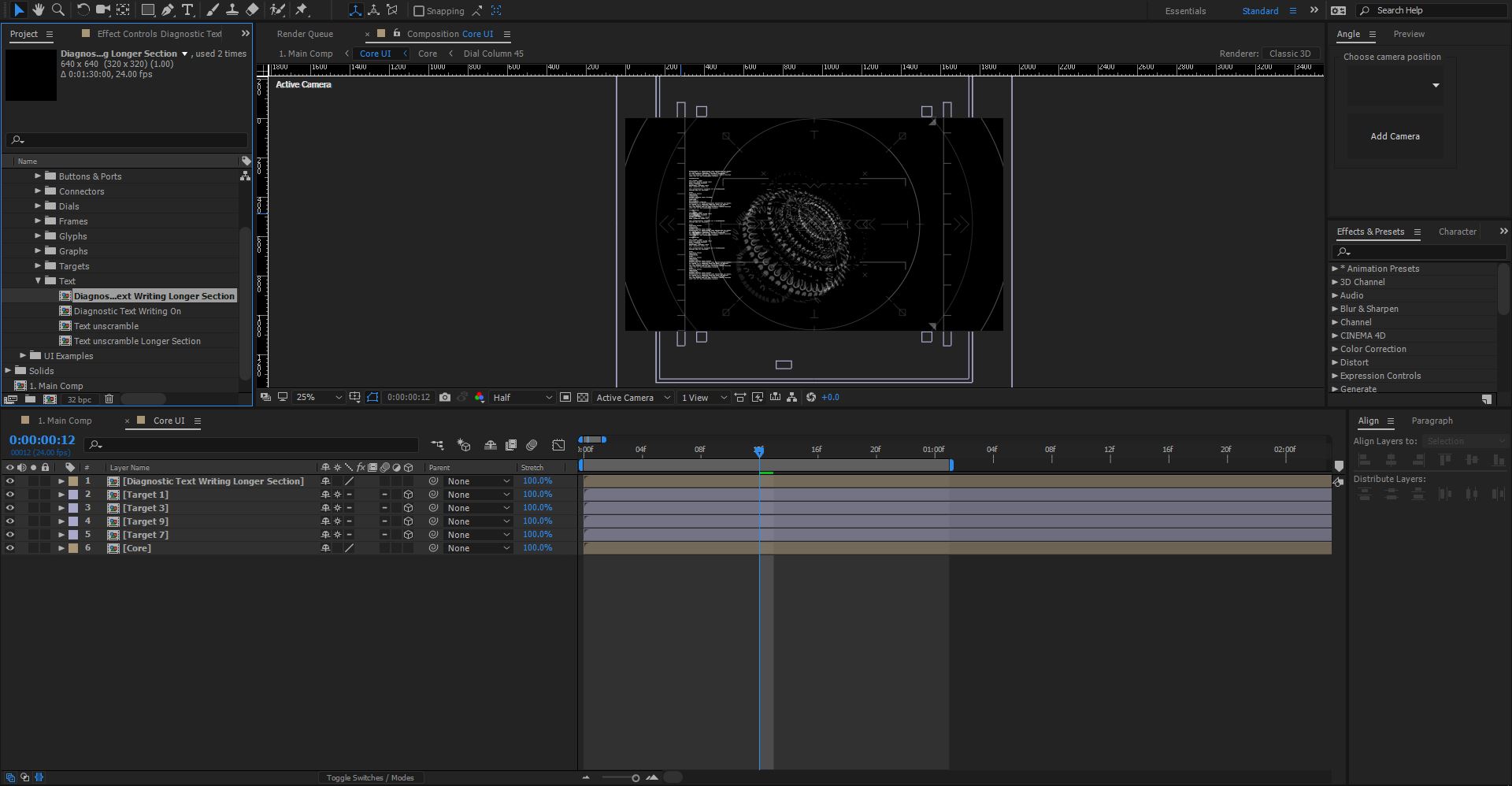
Turn the opacity down to about 30% - this is a nice level of opacity that’ll come into play when we add the glow effects further down the line.
At this stage it’s worth pointing out that Chronos works in exactly the same way no matter what you’re creating, it’s as simple as dragging and dropping the elements you want into your composition and arranging them as you see fit.
Chronos actually comes with 12 pre-designed interface examples in the: Chronos > UI Examples folder, some of these work really well as backgrounds for your interface designs. Select the composition: “Screen G - Ports and Wires” and drag it into your composition below the core precomp.
Change the opacity to about 50%.
This adds a whole bunch of ports and wires, almost like a circuit board, that give the interface an added level of complexity.
Glyphs
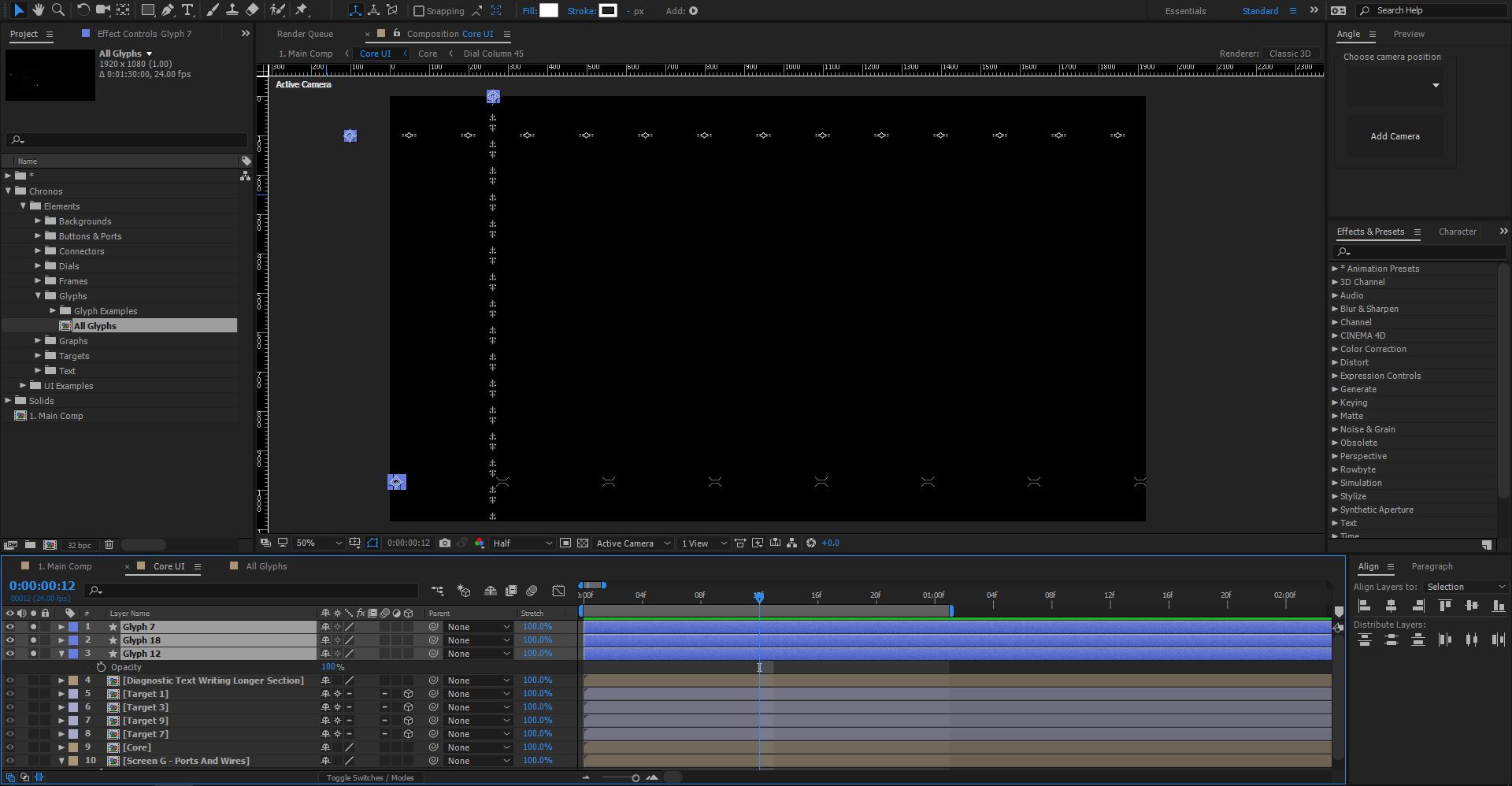
Open up the “All Glyphs” composition in Chronos > Elements > Glyphs.
You’ll see all the different glyphs available as shape layers, these are great for adding little bits of detail to a futuristic interface, they could even make up an alien language if that’s what you’re sci-fi film is about!
For this example, we’ll choose Glyphs: 7, 12, and 18. Copy and paste these into your Core UI composition.
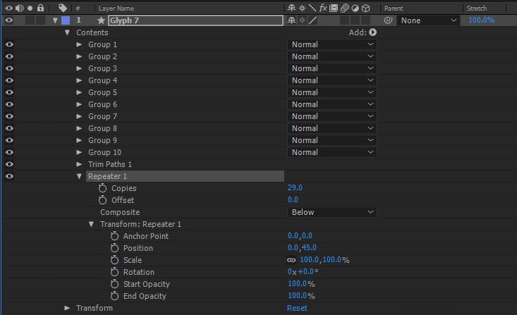
Glyphs are great for repeating multiple times across a composition, rather than duplicate the layers multiple times we can make use of the shape layers repeater option.
In the contents of the shape layer, click the little arrow next to Add, then choose Repeater, open up the settings for this and increase the number of copies to something like 29, we want the glyphs to repeat off screen.
Depending on the glyph, you may want to change the position of the repeater too, here’s an example of our settings:
Do this for the other glyphs you used and arrange them across your composition, the next screen shows how we arranged ours, we’ve solo’d the layers to show you just the glyphs:
Drop the opacity down to about 40%
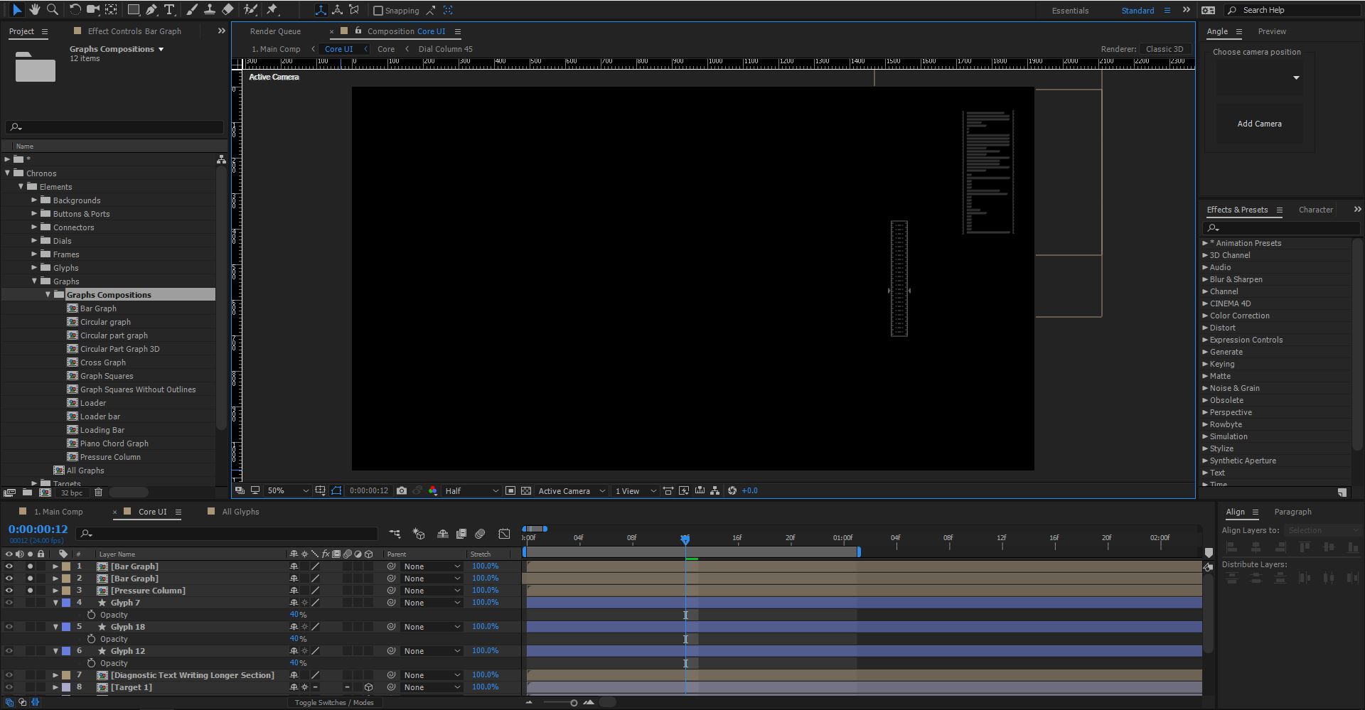
Next, we’ll add some graph elements from: Chronos > Elements > Graphs > Graphs Compositions - we chose the Bar Graph and the Pressure column. As usual just drag these into your composition and arrange them where you like!
To balance things out, the graphs went on the right hand side, I duplicated the bar graph a couple of times to make it slightly longer like so:
(Again the layers have been solo’d to show the position)
Drop the opacity down to about 20% for the bar graph, and 40% for the pressure column.
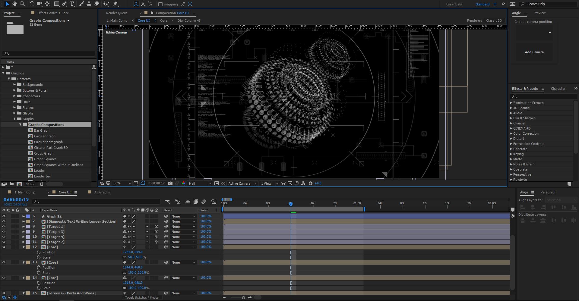
This is all looking good, however the core could do with some work, luckily because it’s all contained in a pre-comp, we can simply duplicate the layer to increase the complexity!
Select the Core pre-comp and hit “Ctrl+D” or choose Edit > Duplicate - now try dragging the duplicated layer diagonally towards the top right - offsetting the layers like this produces a really complex looking object, perfect for a futuristic core design!
Try duplicating the layer again and offsetting it further, perhaps scale it down a bit too to produce a different look, the screenshot below shows the core duplicated twice, one of which is scaled down slightly.
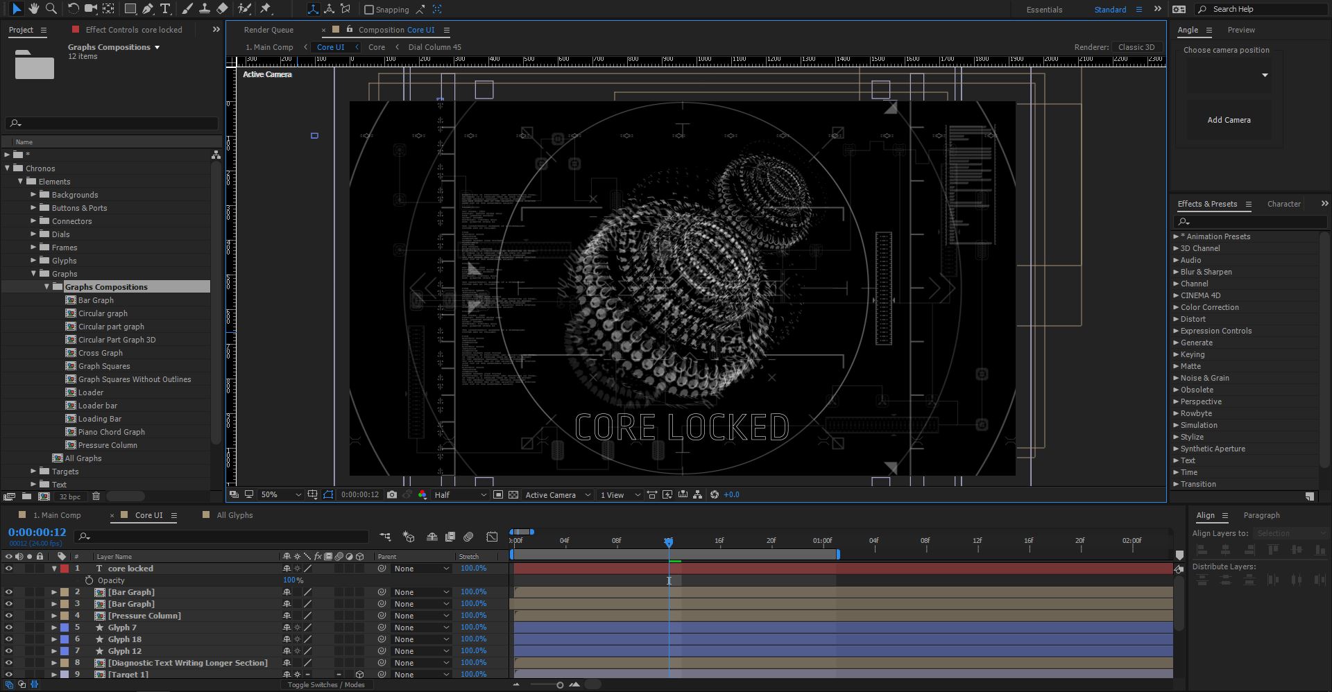
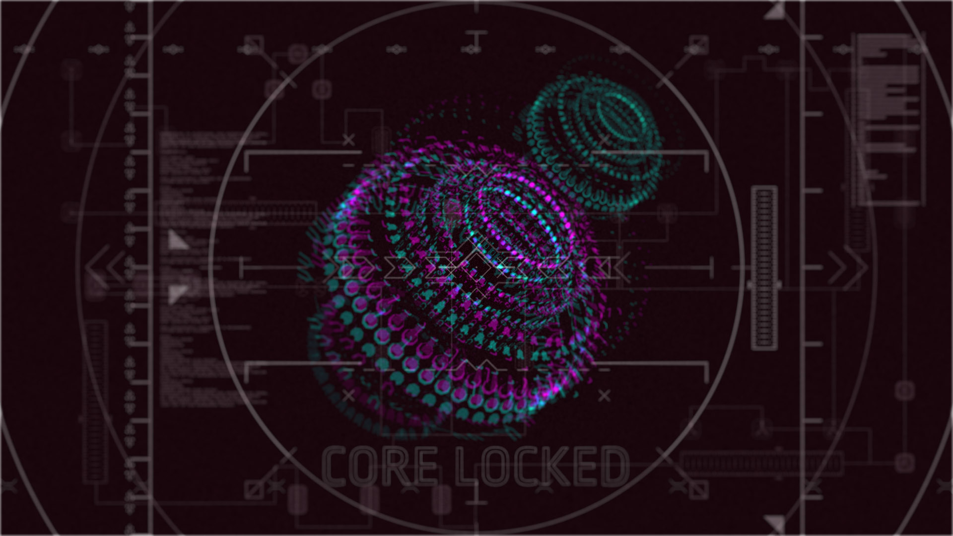
The final element we need to add is a simple text layer, the Chronos pack uses the font ROPA Sans which is a free Google font available here.
Add as much or as little text as you like, we opted for “Core Locked” - I like to picture this interface as being used in some sort of futuristic spaceship, managing the cores of the hyperdrive or something!
Now, that’s pretty much all the elements added to the composition, each composition can be animated however you choose, perhaps try adding a 3D camera and rotating around the core composition, or better yet combine the pack with our glitchy fragment transitions pack to bring elements on screen with a bit of distortion
The next steps are to add some colour and a bit of blur to give it that extra shine.
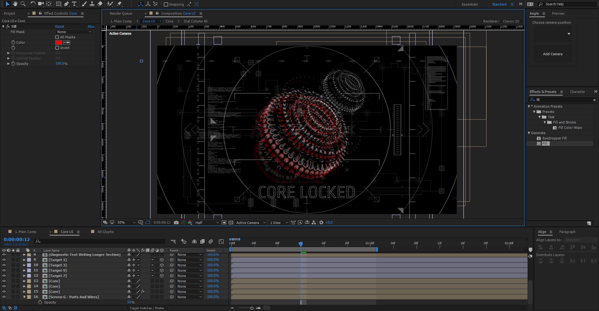
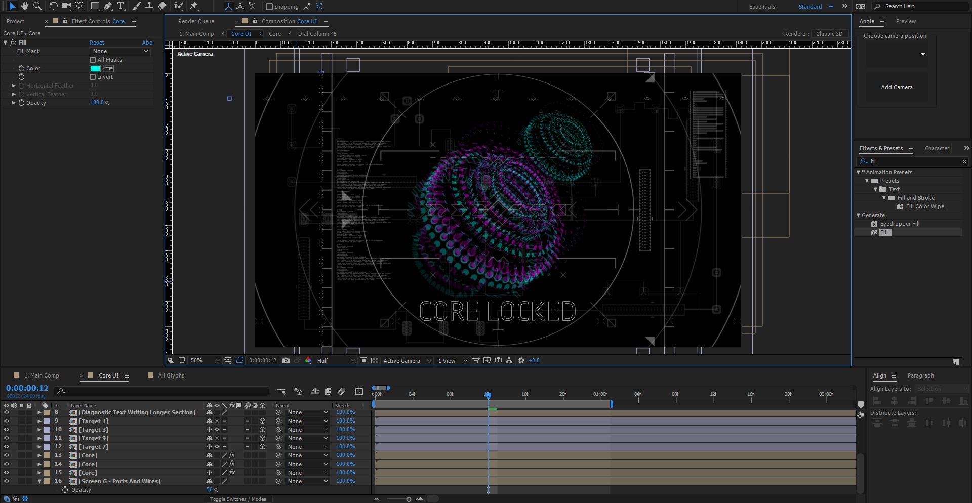
We’ll start with the core - select the bottom layer and choose: Effect > Generate > Fill (or drag the fill effect from the effects panel onto the layer)
The default colour is red, which actually looks pretty cool:
In this example I’m going to use a mix of bright turquoise and magenta for the cores, apply the fill effect to each Core and change the default colour:
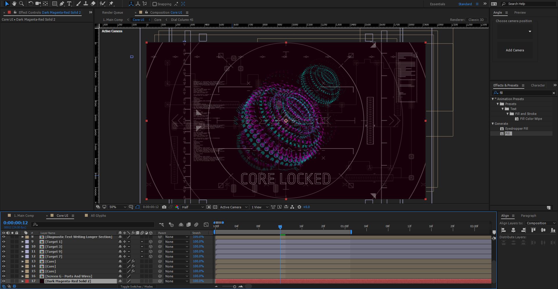
At the moment there’s no background for the entire composition, you can add a black solid layer to the bottom of the composition, however, as all the elements are slightly opaque try adding a solid with a very dark colour on there.
For example, we added a solid (Ctrl+Y) and chose the colour: #170009 - which is a very very dark purple:
Again, it’s all about experimenting to see what works.
Next we’ll add a glow to the whole composition. Add a new adjustment layer: Layer > New > Adjustment Layer and rename it Glow.
Then choose Effect > Stylize > Glow - change the following settings:
- Glow Threshold: 65%
- Glow Radius: 6
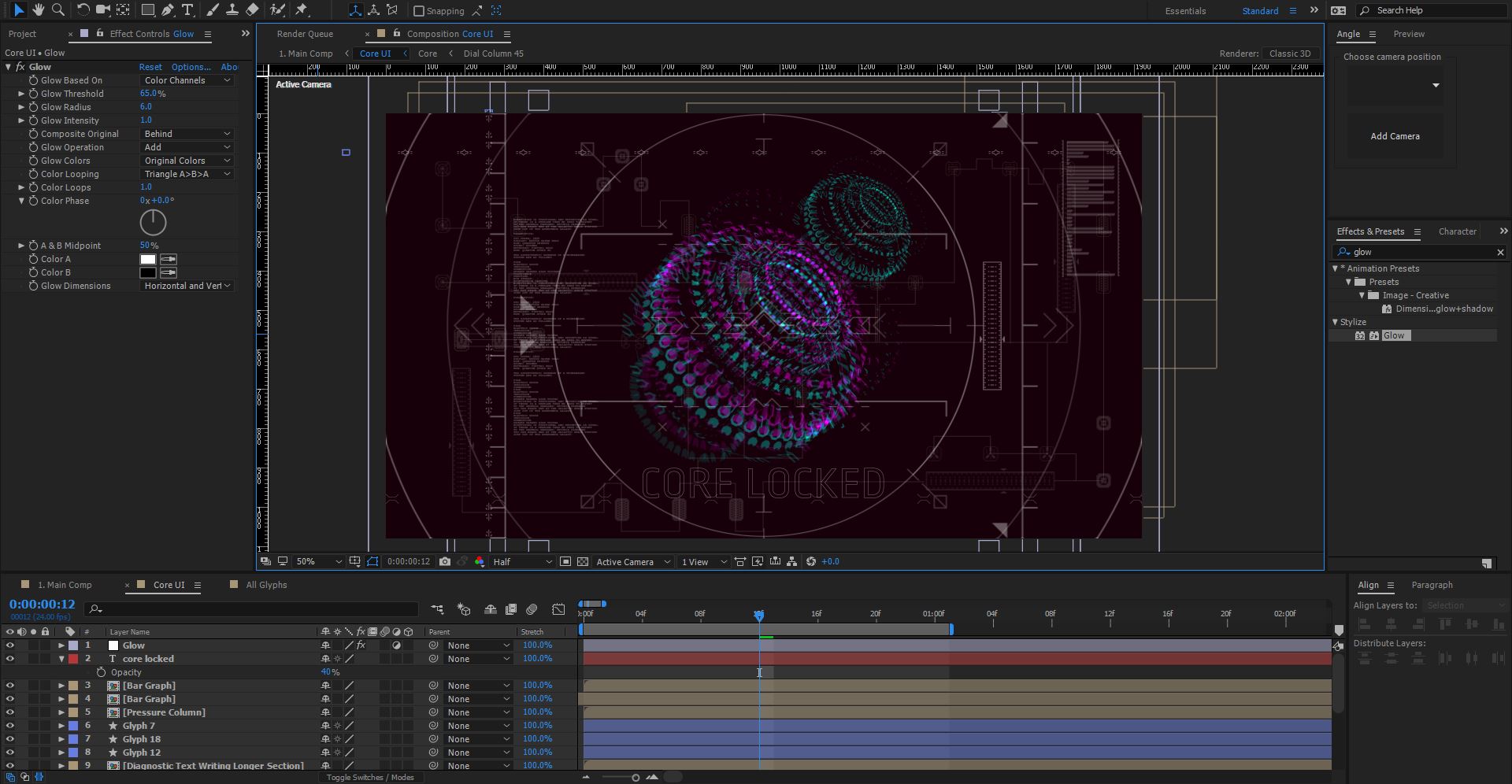
Lovely stuff, try experimenting with the glow settings, cranking up the glow can produce some cool effects!
Finally, we’ll add some blur.
Add a new adjustment layer to the top of the composition, call this one: Blur and choose Effect > Blur & Sharpen > Camera Lens Blur
This will blur pretty much everything which isn’t what we want. To remedy this we’ll create a blur map.
Add a new solid: Layer > New > Solid and call it Blur Map, with the layer still selected, choose: Effect > Generate > Gradient Ramp
Change the Ramp Shape option to Radial Ramp and the Start of Ramp to the centre of the composition (960 x 540) so that you have the following look:
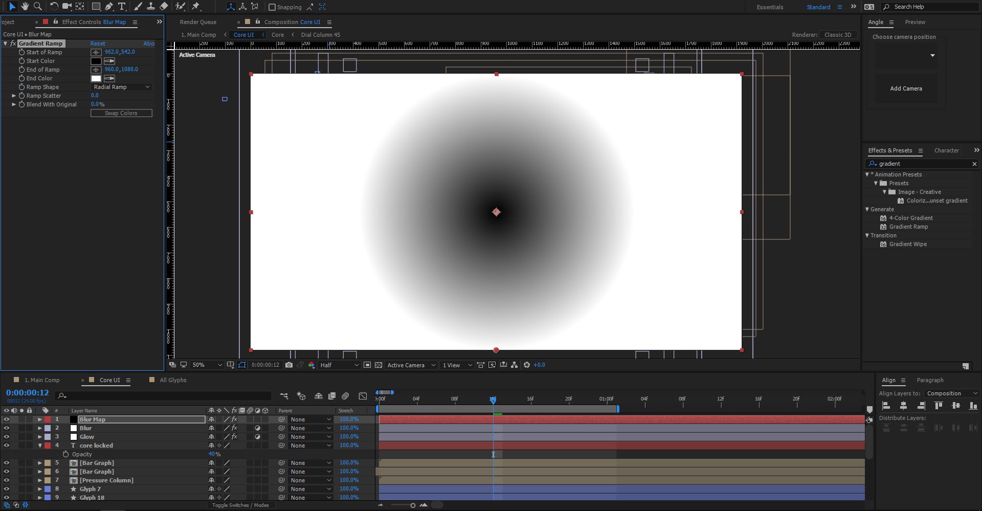
Select the Blur Map Solid and precompose it: Layer > Precompose - call it Blur Map Gradient and be sure to check the “Move all attributes” option and click OK.
Now, we don’t actually need to have this layer visible, so select it and click the little eye icon on the left hand side to hide it.
Then, select the Blur adjustment layer, in the effect controls panel you should see the Camera Lens Blur effect controls, underneath Blur Map there’s a Layer option - in the drop down, select the Blur Map Gradient layer we just created.
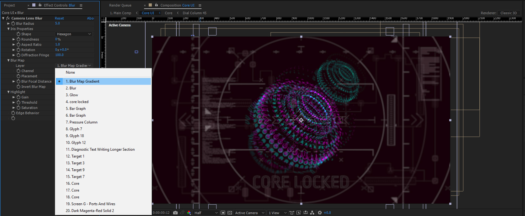
The blur map will now use the gradient to blur the image, the darker sections are clear whereas the lighter bits of the gradient are blurred out. Experiment with the blur amount, rotation etc. to see what works best!
Finally we’ll add a little bit of noise as the finishing touch, add a new adjustment layer and call it Noise place it below the blur adjustment layer. Then choose: Effect > Noise & Grain > Noise.
Change the noise amount to around 10% and be sure to uncheck the “Use Colour Noise” option.
And that’s it!
You’ve just created a futuristic looking sci-fi interface in After Effects! As you can see, all the elements of Chronos operate in much the same way, it’s a simple case of dragging and dropping the bits you want into your own compositions.
In our original example we’d also added a curves effect and a gradient overlay to change the colour up a bit, definitely an area to experiment with until you get the look you want.
Get creating your own sci-fi interfaces with Chronos!
Be sure to show us what you create via Twitter