Futuristic (or fictional) user interfaces (FUI) have become a hot topic in the world of motion design over the past few years. There’s so many wonderful examples to choose from, but here’s our current top 5 sci-fi interfaces:
Her - Champion Studio
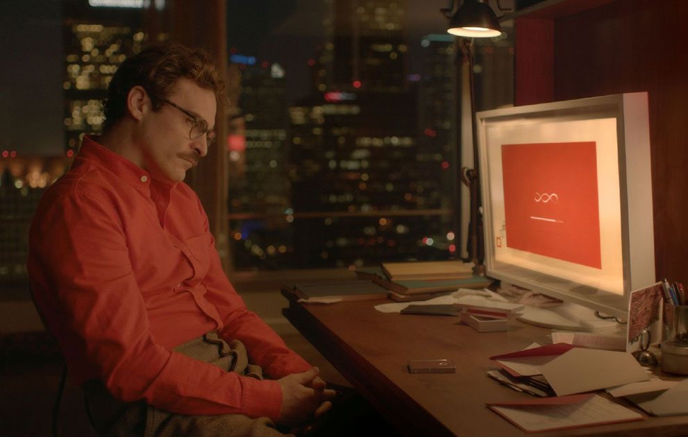
The thing about “Her” is that it depicts what we would call an authentic vision of the future, it’s not all glass screens and sterile environments… just look at the desk! Filled with paper, imagine, a future that still uses paper!
The interfaces throughout the film are also wonderfully designed, and fit within the same aesthetic; there’s elements of the past ingrained within them.
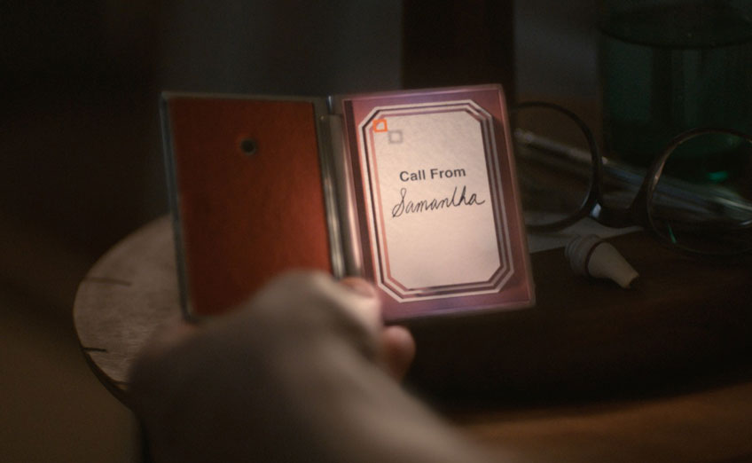
Just look at the mobile interface, the handwritten name, the art deco tones, it really is quite beautiful, and arguably one of the most usable sci-fi interfaces. Granted a lot of the interaction is done by voice in the film, yet with the rise of Alexa, Siri, Google Home.. maybe it’s a future that’s closer than we think!
Read more about the interfaces & other design elements created by Champion Studio
Iron Man (Avengers) - Jayse Hansen
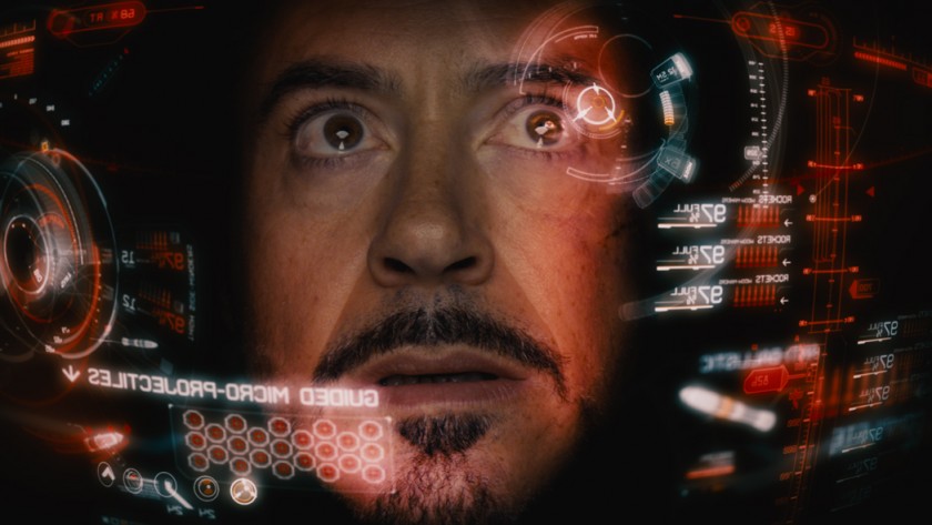
The interfaces in Iron Man are always wonderful to see. Where other films would perhaps choose a point of view shot with the interface overlaid, the iron man films give us a close up of Stark’s face, his thought processes, emotions, all coupled with a wonderfully visual interface. It gives a more human feel to something which could be quite robotic. Quite fitting for iron man.
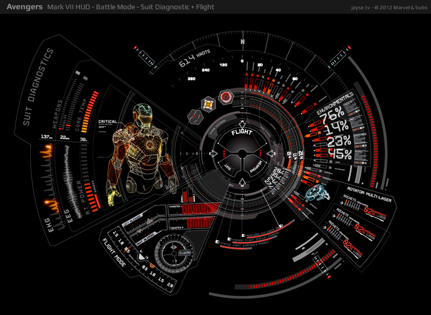
A few studios and individuals have worked on Iron Man over the years, this iteration was created by Jayse Hansen, he goes into some great detail on his process for creating the updated visuals for The Avengers, read more about it on his site.
Guardians of the Galaxy - Territory Studio
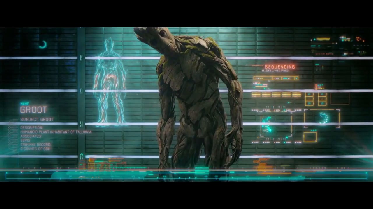
Guardians of the Galaxy is an explosion of colour, it’s one of the most vibrant films of the Marvel universe so far, and that’s reflected in the interfaces throughout the film.
You should also check out Territory Studio’s other FUI work, it’s incredible!
Star Wars The Force Awakens - Blind
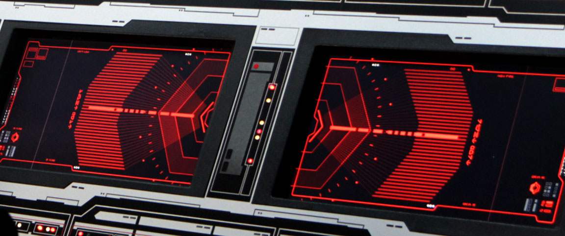
We love the familiarity of the force awakens, especially in the interface design. The interface visuals wouldn’t look out of place in the original films, yet they all have a subtle modern feeling to them, a more refined look perhaps. It does the job of giving you that sense of nostalgia for the original trilogy, while working as a standalone design for the new.
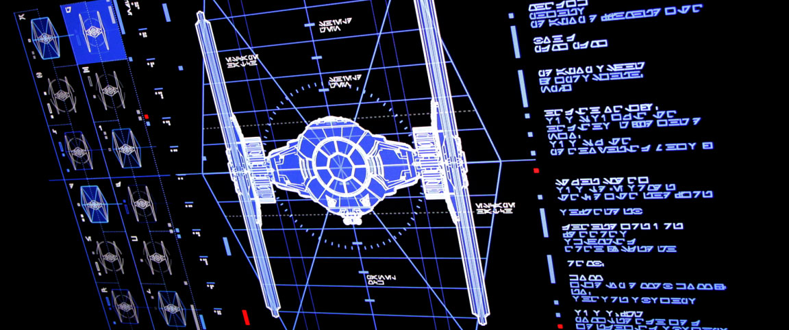
Check out more screenshots from Blind Ltd. The studio behind these gorgeous FUI visuals
Total Recall - Ash Thorp
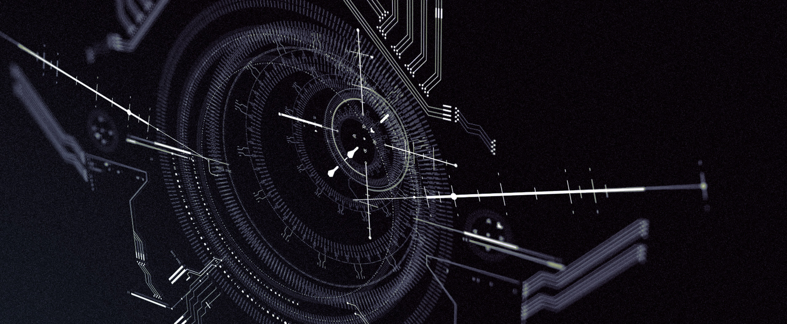
Ash Thorp has quickly become one of the biggest names in the world of FUI design, and it’s not hard to see why. The complexity and detail of the Total Recall interfaces is just one example of the wonderful craftsmanship Ash puts into his work.
Throughout the film, the interfaces are a prominent feature, everything from target displays of robotic police drones, to the phones embedded in people’s hands. It’s a visual feast!
Ash put together a handy reel of the interface work he did, definitely worth a watch:
You should definitely check out his other portfolio work too, wonderful work!
There you have it!
There’s so many other examples of wonderful FUI design out there, if you liked this, you should definitely check out the links below for more sci-fi interface goodness! Alternatively, check out our Chronos Sci-fi interface pack for After Effects, and have a go at creating your own futuristic designs!
Other sci-fi interface resources:
http://sciencefictioninterfaces.tumblr.com/ https://scifiinterfaces.com/ https://www.noteloop.com/kit/fui/movie/